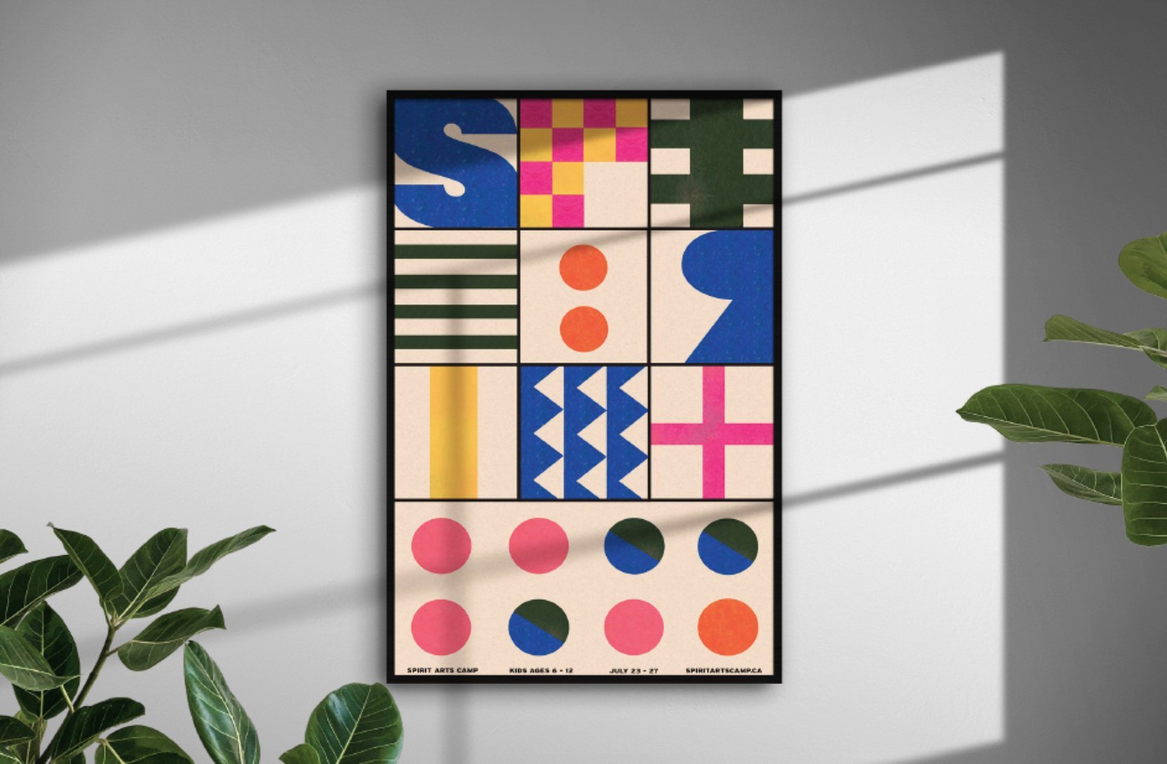
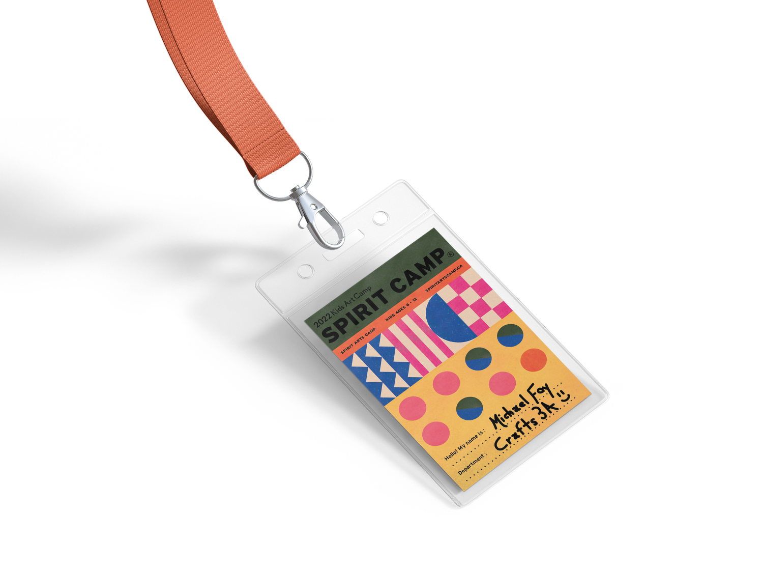
Branding & design project for a children’s art camp. The goal was to generate signups through the use of visually based marketing. I selected these colours, form and text to appear lively, striking and bold. I drew inspiration from the general constructive process of workshops and how ideas come to be formed. The various shapes and misaligned letters aim to represent the building blocks of innovation flowing together to produce something. I illustrated the logo to look like a ghost since the camp has the word “spirit” in it. I explored new ways to incorporate design into a camp's promotional materials by creating colouring pages for children that also serve as an advertisement in an engaging, playful way.


